How container queries could help email
Using @media queries in email has been commonplace for the last decade or so. Although they aren’t supported in every email client, where they do work they can really help enhance the experience for users viewing the email in a variety of viewport widths among other things. Even when they are supported they don’t always preform exactly how we need them to.
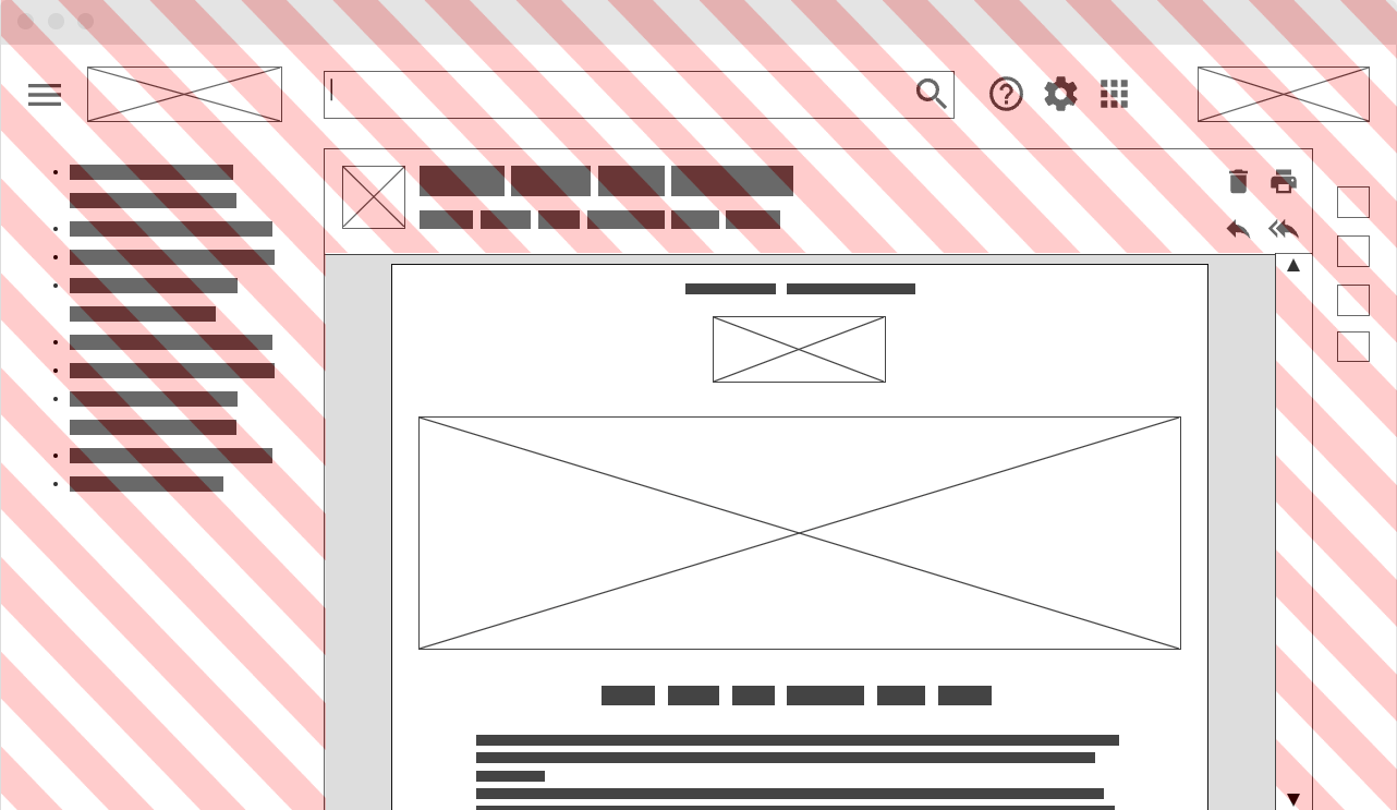
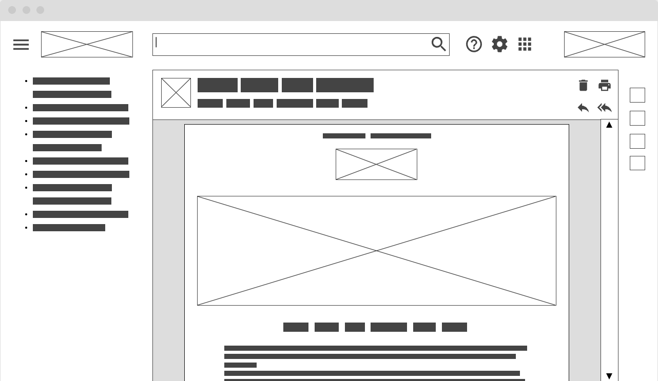
Email clients embed our emails in one of 2 ways. Either the email message will be embedded in an iframe or embedded directly into the flow of the page.
When embedded in an iframe, a media query in the iframe queries the width of the iframe, not the full window. So if we set @media screen and (max-width:600px) the styles within this media query will be applied when the iframe width is 600px or less.

However, when an email is inserted directly into the page, the media query will query the width of the full window and the email message is only one small part of that. So that same query @media screen and (max-width:600px) will only trigger when the page width is 600px or less regardless of the width of the email message. Most likely, it will not trigger at all.

We could try some complex calculations to work out when the page width = X then the email wrapper width = Y but that varies for each email client and also depends a lot on the users settings and layout preference. This is not a reliable or future-proof approach.
Container Queries
Container queries address this issue, as rather than referencing the size of the viewport, they reference the size of a container that we can define in the CSS.
Now that container queries have landed in all major browsers, email clients have the choice to add support. This would allow developers to create more reliable layouts giving a better experience to the end users.
Here is some stripped back code to show how it works
<!DOCTYPE html>
<html>
<head>
  <style>
    .wrapper{
      container-type: inline-size;
      container-name: myemail;
    }
    @container myemail (max-width: 600px) {
      .wrapper h1 {
        background-color: red;
      }
    }
    @container myemail (min-width: 600px) {
      .wrapper h1 {
        background-color: green;
      }
    }
  </style>
</head>
<body>
  <div class="wrapper">
   <h1>container query test</h1>
  </div>
</body>
</html>
Here we have a <div> with a class of wrapper, in the CSS we set a container-type and container-name. Then where we would normally use @media we can instead use @container myemail referencing the name that we set on the container. This will look at the size of that <div> and trigger when our query (min-width: 600px) or (max-width: 600px) matches.
Query units
Along with container queries there are also now container query units. These are similar to viewport units but instead of being relative to the viewport size they are relative to the container size.
cqw1% of a query container’s widthcqh1% of a query container’s heightcqi1% of a query container’s inline sizecqb1% of a query container’s block sizecqminThe smaller value ofcqiorcqbcqmaxThe larger value ofcqiorcqb
Some email clients, such as Gmail and Outlook.com, currently support container units but not containers. In this case these units will be relative to any container used in the email client, or if no container are used there are relative to the viewport.
Current support (as of October 2023)
Container queries are now supported in all major modern browsers. In email there is some support
- On Android: K9, Samsung, QQ, 1&1, GMX, Web.de
- On iOS: AppleMail, Edison
- Webmail: Ionos, Comcast, Libero, iCloud
Seeing this support starting to come into email clients is great. However, where we really need it is in email clients that embed the email code in a webpage rather than using an iframe. These include some of the biggest names; Gmail, Yahoo, AOL, Outlook.com. All of which are yet to add support.
So things are looking promising for the future, but it’s maybe still a little too soon to have a real impact on your emails.
Current Issues
One major issue that is preventing developers from using container queries in email at the moment is with Appel Mail desktop app. When setting container or container-type the whole email is hidden. This happens both when setting this style inline or embedded.
When can we start using container queries
Currently the issue with Apple Mail is really holding developers back. Once that is fixed, then it’s certainly worth starting to experiment with container queries.
As support grows early adopters may have to start duplicating styles inside both media and container queries, but I believe most sizing media queries can be eventually replaced by container queries as they are a more appropriate format, whilst media queries will be used more for user preferences such as prefers-reduced-transparency, prefers-reduced-motion and prefers-color-scheme.
We think the case is very clear for supporting container queries and would like to ask any email clients to start looking into adding support, and to contact us for any question.